
Kitchen Renovation Before and After
64
Published Oct 17, 2018, Updated Jan 14, 2022
This post may include affiliate links. Thank you for your support.
Time for the big reveal… our kitchen renovation is complete and I’m so excited to share the before and after photos. We turned our Cape Cod 1950’s retro kitchen into a bright and modern space that feels so open and airy.
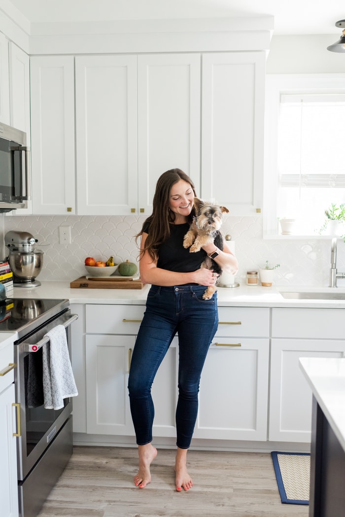
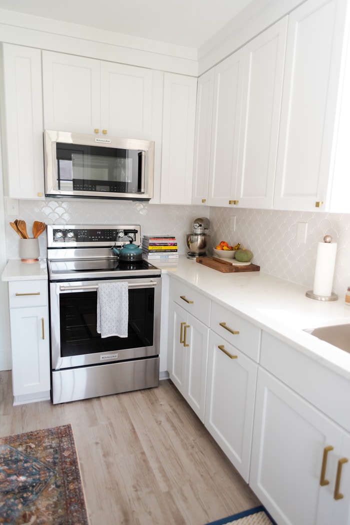
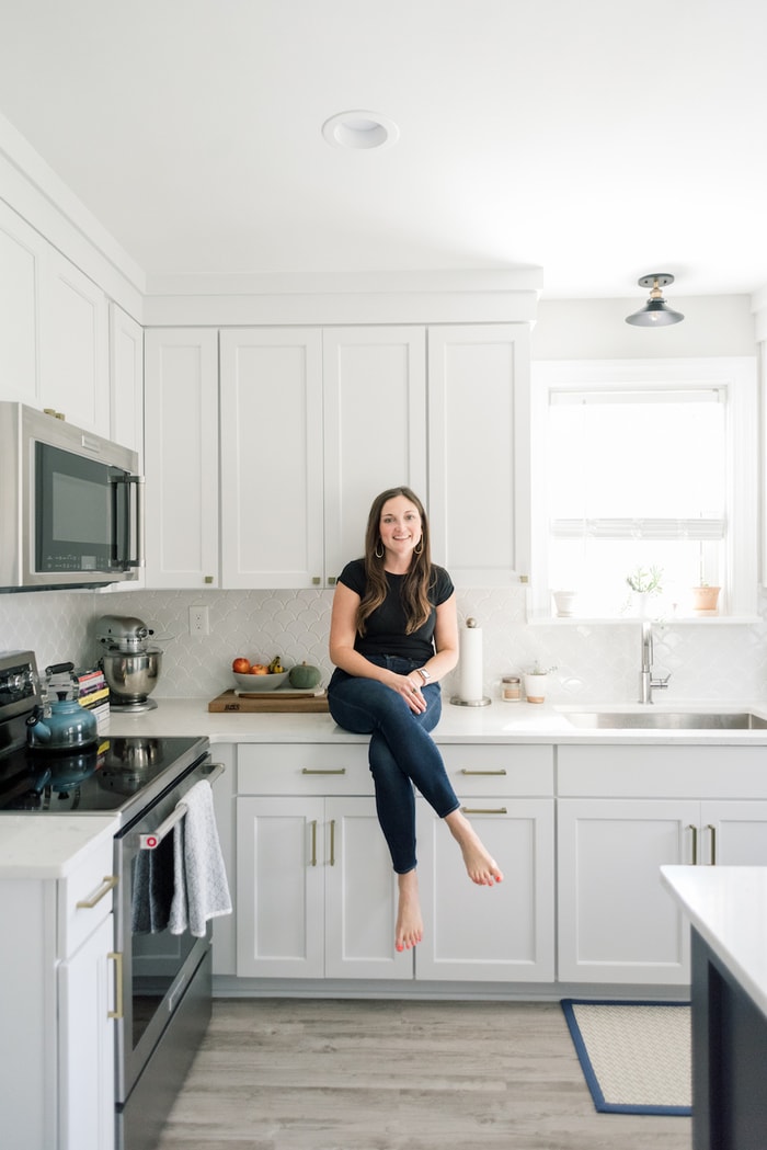
Welcome to our new kitchen! It’s modern, bright and makes me smile so big every time I walk in. I’m kinda’ sorta’ obsessed, and pinch myself daily questioning if I’m dreaming… I still can’t believe this kitchen belongs to us.
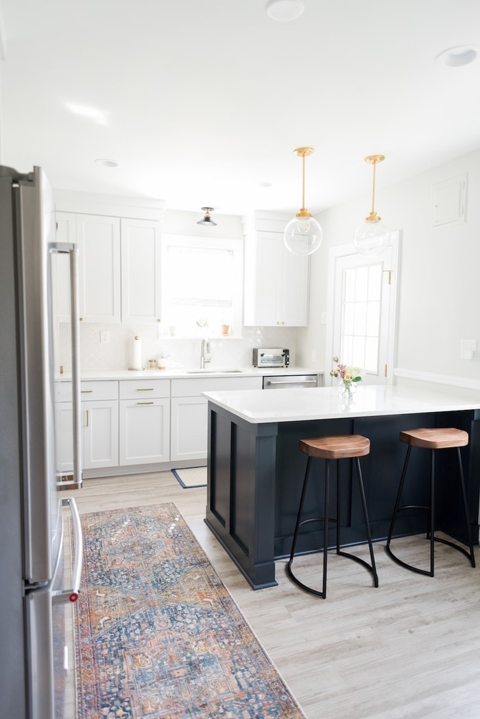
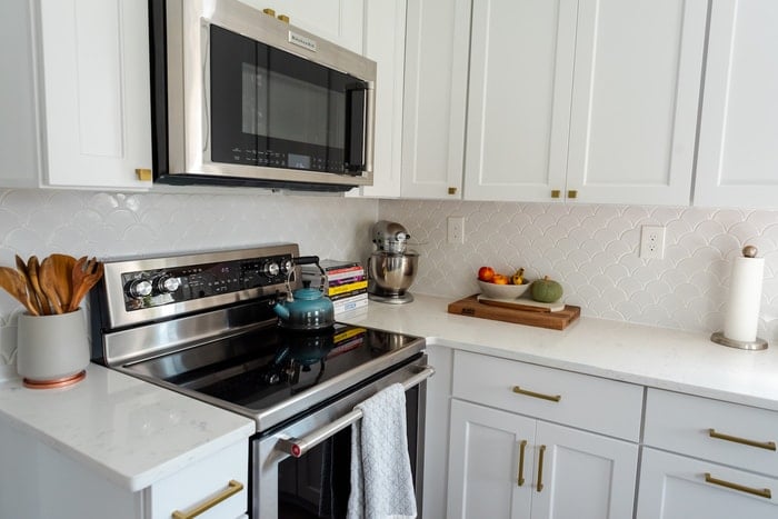
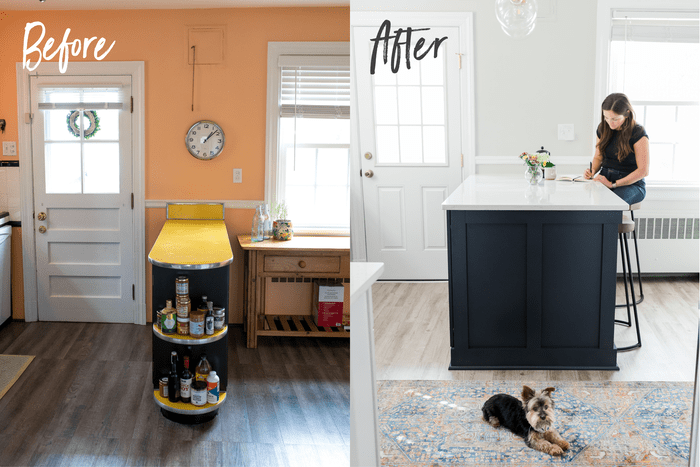
This next shot is my absolute favorite because you can see the whole space, including the contrast of the navy peninsula with the white cabinets and backsplash, the antique brass pulls, the pendant lights and the rug.
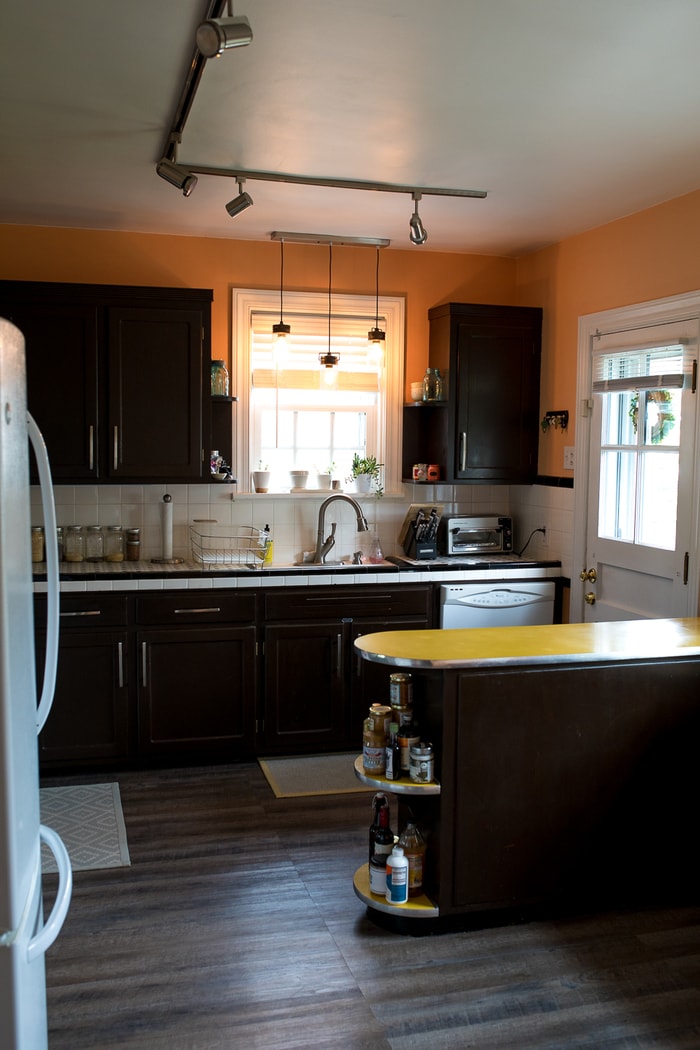
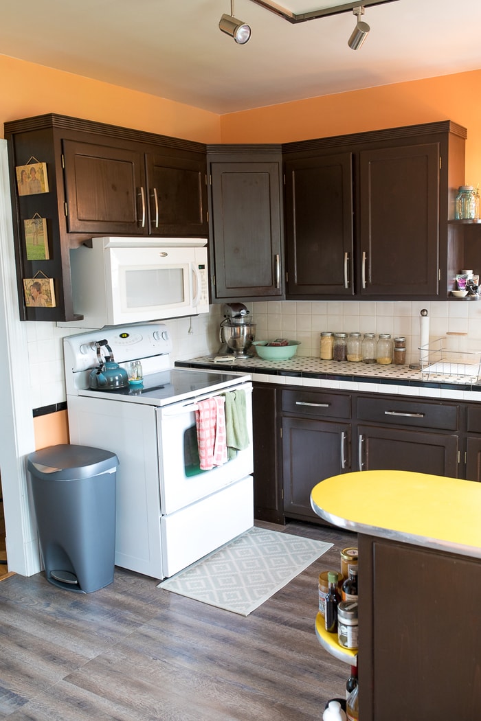
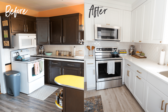
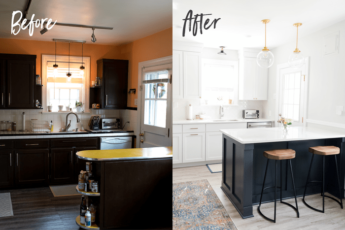
And here’s a before photo from the same angle, just so you can see the retro kitchen we were working with before. I’m still unsure which part I was most excited to see go — bright orange walls, the tile countertops that were impossible to clean, the clunky track lighting or the bright yellow, diner-style peninsula with shelves that ended up storing my nut butter collection.
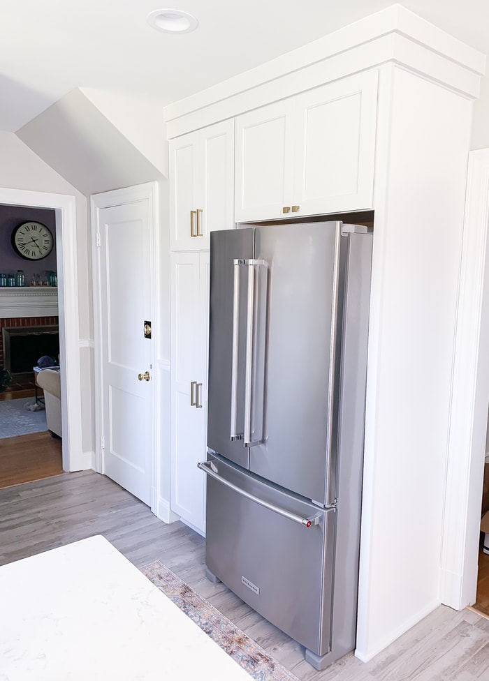
As you can see, we kept the same layout because after discussing a bunch of different ideas, we decided there really wasn’t much we could do to change the layout given the space. You can’t see it well in these photos, but we did decide to close off our small pantry (which also holds the HVAC piping) so that we could add cabinetry beside and around the fridge.
This has been a game changer, and I don’t miss our tiny pantry at all because the new cabinet situation and pull-out shelves make for an awesome pantry and turned the area around the fridge into usable space.
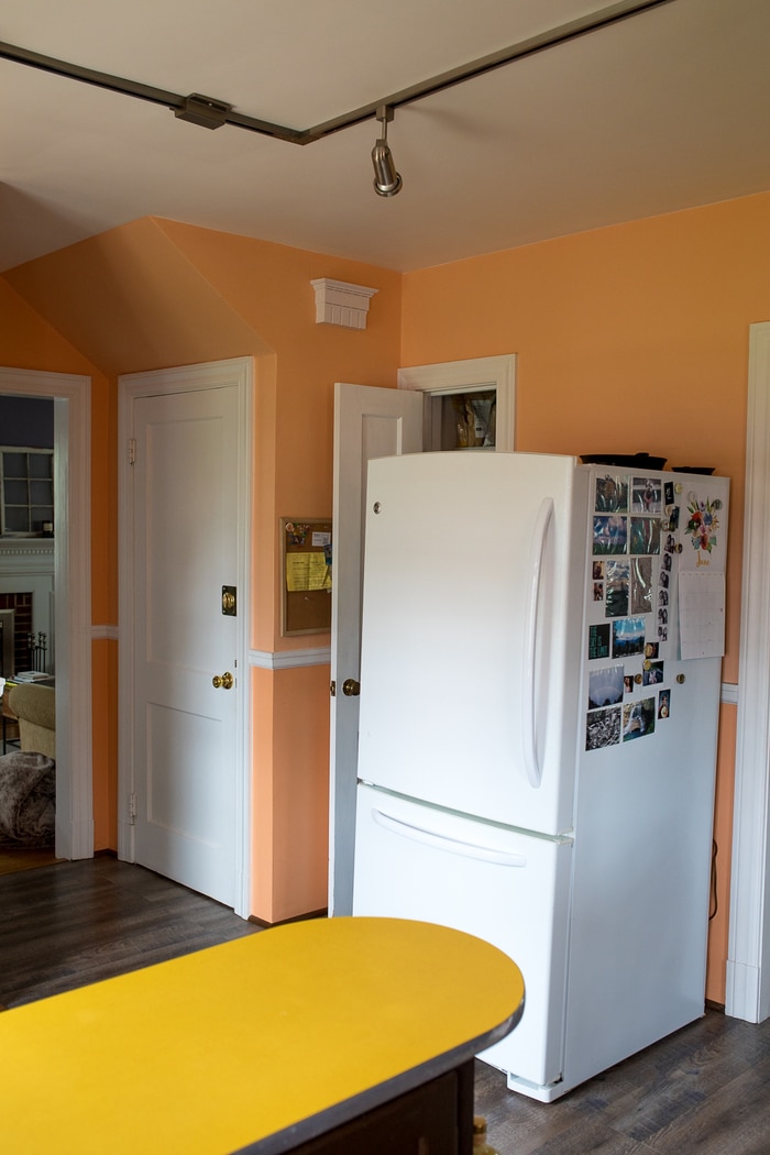
Sadly, the fridge photos and magnets had to go! Gotta put all those photos in a album.
One thing I was dead set on before renovating was a farmhouse sink. I really love the look and thought for sure it was what I wanted for our space, but after working with a local design company (Lustre Home) to help pick everything out, they recommended going with a square stainless under-mount sink instead. Once I saw this option I was sold! Our old sink was white porcelain (like most farmhouse sinks) and it was terribly stained and so hard to keep clean. To make matters worse, the edges around the sink were sealed, and the caulk had started peeling and turned black… not a pretty look. Given the state of our current sink, I actually liked the idea of having an under-mount sink that was stainless. And the one we purchased is super deep and has a wire rack to prevent scratching. I also like the wire rack because we’re able to use the sink as a drying rack if needed.
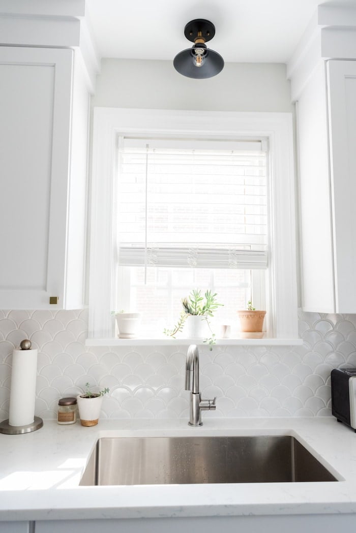
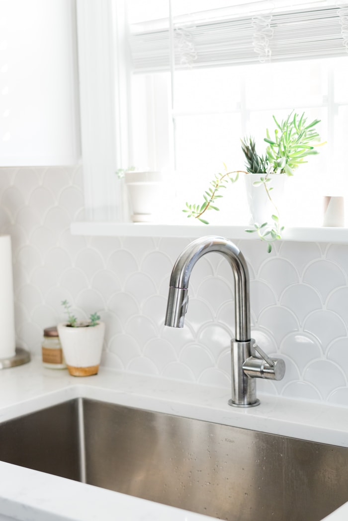
Two of my favorite components of the new kitchen are the backsplash and the countertops. I knew from the get-go that I wanted a bright white kitchen, so I thought about going with the traditional white subway tile backsplash at first. I’m so happy that the Lustre Home ladies convinced me to go with the fan/fish scale tile because we absolutely love it. The pattern is subtle, but it adds a really nice touch of dimension that helps offset the overload of white. It also feels a bit more unique considering I’ve never been in another kitchen with a similar backsplash.
And here’s a before at this angle because everyone loves a good before and after.
We ended up purchasing all new appliances as well. The appliances we had were left from the previous owners, they didn’t match and were quite old. Now everything matches and so far the Kitchen Aid appliances we picked out have been working great. I think the fridge is my favorite part of the appliance upgrades. After three years in this house, we finally have a working ice maker and a purified water dispenser! I’ll have to do a full fridge tour so you can see my sparkling water and chocolate drawer — it’s pretty awesome!
For the countertops, I went into the design process thinking I wanted marble, but once I realized how easily they stain and scratch, I changed my mind and decided to go with quartz instead. Plus, we have plenty of marble in the new master bathroom. For the countertops I chose a stone that has a similar look to marble called Cashmere Carrara. It’s a subtly gray veined polished quartz from MSI.
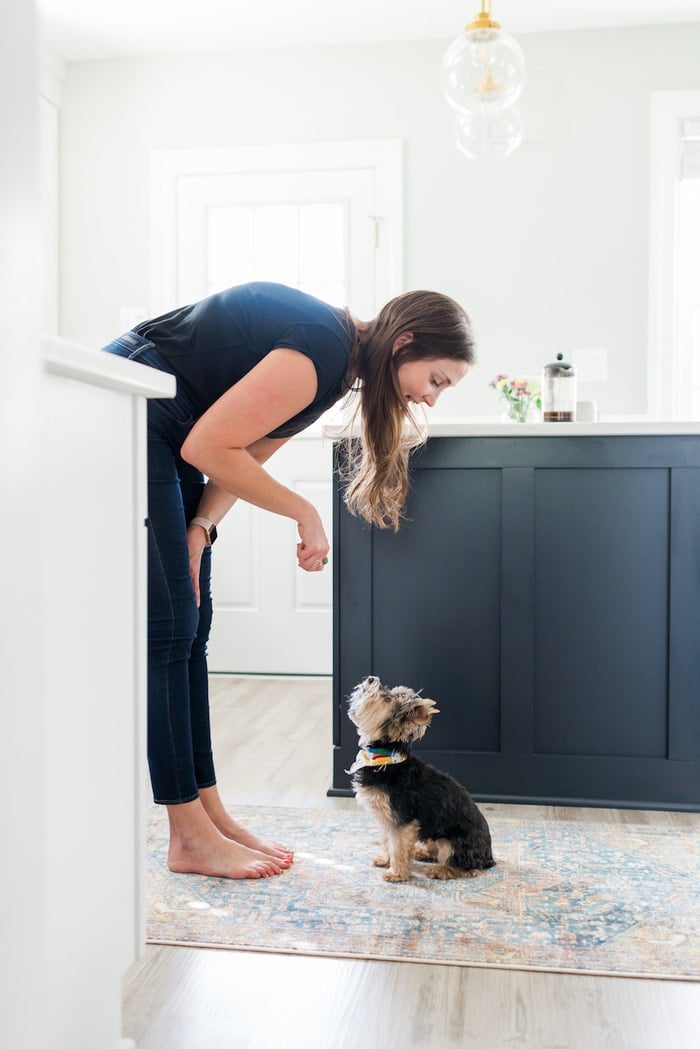
I have to mention that Olive loves the new kitchen too. She’s super funny about eating and always takes food from her bowl to eat it on a rug in the living room. Now that we have a rug in the kitchen she doesn’t have to travel far for a comfy spot to dine… haha! #spoiledrotten
So there ya have it… here’s our new kitchen! I’m so excited to start cooking up lots of delicious and healthy recipes for you in this space!
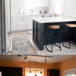
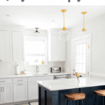
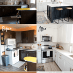
And just for kicks, here are a few side-by side-before and afters. I still can’t over the transformation!
source list: paint color: Benjamin Moore Moonshine / backsplash tile / countertops / flooring / pendant lights / semi-flush mount light /vintage brass square knob / vintage brass pull / square undermount stainless single bowl sink / faucet / runner /kitchen mat / fridge / range / microwave / dishwasher / similar bar stools
Photos by the lovely Michelle Chu Photography.


Yes! Your kitchen is just like a dream! I am loving it!
Thank you!
A perfect example of a modern, white, bright, and airy kitchen! You are lucky to have this!
Thank you!
Wow, I’m in love with your kitchen transformation. The two-tone cabinets are such a good touch. It makes me want a fresh cabinet painting so bad.
Thank you for your ideas and inspiration.
Thank you so much, Hazel!
Gorgeous! Are you able to tell me the blue of your island please?
It’s not a specific paint color, it’s just the navy blue offered by Koch cabinets.
Thank you for this relevant information for my kitchen.